Responsive, Email Marketing 18 May 2020 Test post Nam at tortor in tellus interdum sagittis. Sed fringilla mauris sit amet nibh. Maecenas vestibulum mollis diam. Praesent egestas neque… jacob.herrera@sanmita.com
Uncategorized, Responsive, Higher Education, User Experience, SEO, Usability, Design, Site Performance, Government, How To The average adult spends nearly 20 hours per week on the Internet 16 Jul 2018 Website Accessibility: What You Should Know The accessible web means that people with disabilities can perceive, understand, navigate, interact with, and contribute to the web. This… debbie.m No Comments
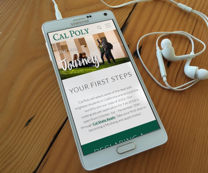
Responsive, Mobile, Higher Education, iPhone & iPad, User Experience 30 Apr 2016 Texas Wesleyan Ups Responsive Design As mobile use surges, our partners at Texas Wesleyan University are making a strong commitment to be mobile-friendly. In partnership with Sanmita, Texas Wesleyan is upgrading its entire website to… debbie.m No Comments
Responsive, Mobile, Higher Education, Design, Non profit 13 Aug 2014 Introducing Generation Z – Under 20 And Coming On Strong The “Millennial” generation, born 1976-1994, has been called the most researched generation in history. The well-documented habits and attitudes of these children of the baby boomers are the driving force… debbie.m No Comments
Uncategorized, Responsive, Mobile, iPhone & iPad, User Experience, Android, Usability, Design, Non profit 30 Jul 2014 What Would Venus de Milo Say? The Importance of Mobile Design for Non-Profits We've been working with Wharton Studio Museum, a cinematic non-profit here in Ithaca, and came across an amusing post on their Facebook page that got us thinking. It was a… debbie.m
Responsive, Mobile, User Experience, Usability, Design, Non profit 28 Jul 2014 Wharton Studio Museum Nears Launch Sanmita is pleased to announce that the Wharton Studio Museum website is close to launching! The goal of the Ithaca Motion Picture Project has been to transform a forgotten silent… debbie.m
Responsive, Mobile, iPhone & iPad, User Experience, Android, Usability, Design 23 Jul 2014 Have You Tried Our Free Responsive Site Tester? Do you know how your website looks and performs on different mobile devices? Sanmita offers a totally free, easy to use online app to test how your website appears across… debbie.m
Uncategorized, Responsive, Mobile, Higher Education, Social Media, iPhone & iPad 19 May 2014 Making International Connections Higher education is increasingly an international affair. U.S. schools are eagerly growing their international enrollment, which adds diversity to the student body and, eventually, to its alumni. Competition for these… debbie.m No Comments
Responsive, Mobile, Higher Education, Social Media, iPhone & iPad 28 Apr 2014 Mobile Use Surges, Smartphones Lead Charge Across the U.S. and on college campuses, mobile use is exploding. Mobile is no longer the future -- it is very much front and center. Now, new research offers some… debbie.m No Comments
Responsive, Mobile, Higher Education 20 Mar 2014 The Case for Mobile-Friendly Sites Still contemplating a mobile-friendly website? Don't put it off any longer. Higher education websites need to be mobile-friendly to reach prospective students, as teens are avid users of handheld devices.… debbie.m No Comments